

Friday, July 17th 2026
App Store Optimization for Shopify brands: your listing is a landing page
Written by

For a single-brand Shopify app, App Store Optimization means two things: making sure people who search your brand name find and recognise you, and turning the App Store listing into a page that earns the install. Broad category ranking is a secondary goal, though specific needs, features, and category-plus-brand searches can still bring qualified discovery.
That reframe matters, because most brands treat the listing as a form to fill in once and never touch again. It's closer to a landing page. Not every channel routes through it (a web checkout, an SMS deep link, or an in-app flow may bypass the store entirely), but branded App Store search and several of your install prompts land here, and when they do, the icon, screenshots, and first two lines decide whether the tap becomes a download. This guide covers what each field actually does, how to build screenshots that convert, how the best apps test and refresh their listings, how often to change things, and how to run a seasonal listing (new icon and all) for Black Friday and your biggest campaigns.
A note on sources. The character limits and the promotional-text and review-prompt rules below are confirmed by Apple and Google. How the stores rank (which fields carry weight, whether ratings feed search) is mostly practitioner consensus and observation, not published algorithm detail. This guide flags which is which. Treat the ranking claims as things to test, not laws.
What ASO actually means for a Shopify brand
ASO for a brand app splits into two goals, and they need different work.
Discovery: win your own name, and the terms next to it. The searches that matter most for a brand app are your brand name (and its misspellings), plus a handful of adjacent intent terms ("[brand] app," "[category] + your brand"). Own those completely and don't lose your own branded search to a competitor or a lookalike. Broad head terms are usually a poor use of a single-brand app's effort, though a distinctive feature or category-plus-brand query can still bring qualified installs.
Conversion: earn the install once they land. This is where most of the return tends to sit, and it's worth stating as a hypothesis to check against your own acquisition mix rather than a universal law: for many brands, higher listing conversion moves more installs than incremental discovery does. The listing is often the last step before the install, and its icon, screenshots, and first lines decide whether a visit becomes a download. A listing that converts a few points higher turns the same traffic into more installs at no extra media cost.
App growth mostly comes from converting the audience you already own, not strangers discovering you in the App Store. The Shopify mobile app growth guide covers the full process.
The fields you get, and which ones do the work
Your listing has a fixed set of fields, and they are not equally important. The distinction most brands miss: Apple and Google weight different fields, so the same copy does different jobs on each store.
| Field | Apple App Store | Google Play |
|---|---|---|
| App name / title | 30 characters | 30 characters |
| Subtitle (Apple) | 30 characters | n/a |
| Short description (Google) | n/a | 80 characters |
| Keyword field (Apple) | 100 characters, comma-separated, no spaces, hidden from users | n/a |
| Description | 4,000 characters | 4,000 characters |
| Promotional text (Apple) | 170 characters, editable without an app update | n/a |
(Character limits are confirmed by Apple and Google. The ranking notes below are practitioner consensus.)
A few consequences worth internalizing:
- On Apple, your searchable text is generally understood to come from the name, subtitle, and keyword field: roughly 160 characters total (30 + 30 + 100). Don't repeat words across them; the common understanding is that Apple combines these fields, so "brand" in the name plus "sneakers" in the subtitle plus "running, trainers" in keywords covers more ground than saying "sneakers" three times.
- Apple's description is widely treated as not affecting search ranking, so write it for humans and conversion. Google Play's full description, by contrast, is generally treated as indexable keyword surface, so on Google it does more search work. (Apple does confirm that promotional text has no effect on ranking.)
- Promotional text is your no-review lever. Those 170 characters at the top of the Apple description can be edited any time without submitting an app update, which makes them the right home for time-sensitive campaign lines ("App-only early access to Black Friday, starting Thursday").
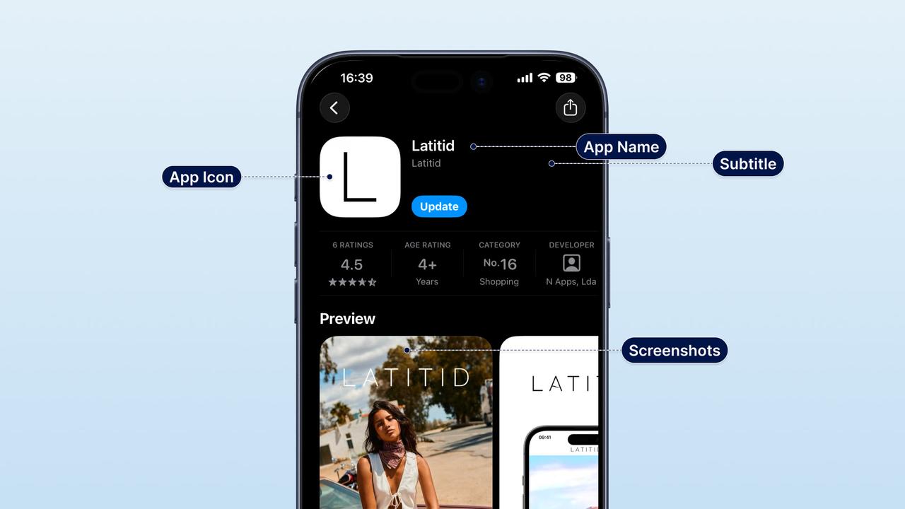
Your screenshots are the page
Screenshots do more conversion work than any other asset on your listing, so treat them as the page itself. Apple does not publicly document screenshot text as a keyword-ranking field, so build them for clarity and persuasion, not keyword stuffing.
How to build them for a brand app:
- Lead with benefits, not empty UI. Each of the first three screenshots should make one clear claim: app-only prices, early access to drops, faster checkout, loyalty points front and center. Blank pretty screens convert worse than screens that state what the customer gets.
- The first two or three carry the listing. Many visitors never swipe past them, so put your strongest claim first.
- Write captions as clear, benefit-led phrases, because a caption like "Track your order in real time" persuades where a one-word label doesn't.
- Localize them where you have real market demand. If a market is meaningful, ship a set in its language; a single English set shown everywhere leaves conversion on the table. Then test the effect on product-page conversion rather than assuming.
The App Store listing deserves the same care as the hero section of your homepage. We break down the full pre-launch asset list (screenshots, icon, copy, and the rest) in the Shopify mobile app launch checklist.
Icon, preview video, and ratings
The icon is your recognition asset. In branded search, the icon is often what the customer is scanning for. Keep it your brand mark, legible at small sizes, and consistent with the icon on your website and marketing, so someone who tapped an email recognizes it instantly in the results. Save the creativity for seasonal variants (below), not the everyday icon.
An app preview video can lift conversion when it shows behavior. A 15-to-30 second preview of the app being used (browsing, a drop, checkout) often converts better than static screenshots alone, especially for video-and-drop-driven brands. On Apple it can autoplay in the results, so the first few seconds matter most. Test it against a no-video page rather than assuming it wins.
Ratings are widely treated as an ASO signal, and they help conversion. A higher rating tends to lift both listing conversion and, in most practitioners' experience, ranking. On prompting:
- Apple limits you to requesting a review prompt three times per customer in a 365-day period, and the system, not you, decides whether to actually display it. So you can request a prompt at a considered moment, but you can't force it to appear.
- A sensible moment to request one is just after a clearly positive experience, such as a first successful purchase. Whether that specific timing beats others is worth confirming with your own data before treating it as a rule. We cover where review requests fit in the launch arc in the first-90-days guide.
Test your listing like a landing page: PPO and custom product pages
This is where the best ecommerce apps pull ahead, and it's available to you directly when your app is published on your own App Store Connect and Google Play accounts. Two Apple tools do most of the work.
Product Page Optimization (PPO) is Apple's built-in A/B test. You run up to three alternate versions (treatments) of your default page against the original and see which drives more downloads, measured with impressions and statistical confidence in App Store Connect. Per Apple's current guidance you can vary the icon, screenshots, app previews, and the description. Your core searchable metadata (the name, subtitle, and keyword field) isn't part of a PPO test. Each test runs up to 90 days, and only one runs at a time, so pick the highest-impact element first, usually the first screenshot or the icon.
Custom Product Pages (CPP) match the page to the traffic. Apple lets you build up to 70 custom versions of your listing, each able to use its own screenshots, app previews, promotional text, and keywords, each with a unique URL, and each approved by Apple before it goes live. These are not A/B tests; they are tailored landing pages. Send your "Black Friday early access" email to a CPP whose creative leads with exactly that, and the message stays consistent from tap to install. Google Play offers similar capabilities under different names: store listing experiments (A/B tests) and custom store listings (per-audience or per-country pages).
Your listing is not one page. It is a set of pages you test and target, much like the landing pages used for paid traffic.
How often should you change your assets and copy?
Change your listing when you have a clear hypothesis, not on impulse, and change one or two things at a time so you can attribute the result. There's no published algorithm-settling timeline from Apple or Google, so treat cadence as testing discipline rather than a fixed schedule:
| Discipline | What it means in practice |
|---|---|
| Change on a hypothesis | "We think a benefit-led first screenshot will beat the current UI shot." Write it down before you change anything. |
| Keep a control period | Note the change date and your traffic mix, so a spike from a campaign doesn't get misread as an ASO win. |
| Give it enough qualified traffic | Let a change accumulate enough installs to judge conversion before you conclude anything. PPO's confidence readout helps here. |
| Move one or two elements per cycle | Swap the icon, three screenshots, and the subtitle at once and you've learned nothing about which one moved installs. |
| Tie creative refreshes to real events | Refresh around launches, campaigns, and seasons, where there's a genuine reason, rather than redesigning on a calendar. |
| Use promo text and CPPs for fast-moving messaging | They let you run campaign creative without touching your core searchable metadata, so your baseline stays stable while campaigns move. |
The reactive trigger is worth calling out: if a competitor takes a branded or category term you were holding, or your conversion visibly drops, that's a reason to revisit the listing regardless of where you are in a cycle.
Seasonal ASO: the Black Friday makeover
Your biggest sales moments are a good reason to dress the listing for the occasion, with one honest caveat: seasonal creative can lift results, but a weak seasonal redesign can underperform a tested evergreen page. So the right move is to test the seasonal version or run it as a campaign-specific page, not to assume new automatically beats proven. Here's how to run it, including the icon question every brand asks.
Yes, you can change your app icon for a campaign, with a catch on timing. There are two different icons, and they behave differently:
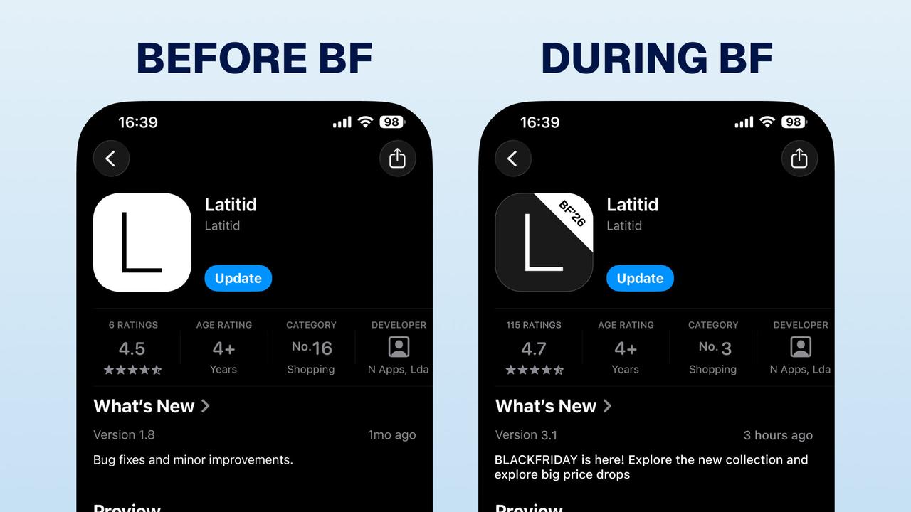
- The App Store listing icon (what shows in search results) changes only by submitting a new app version for review. So a Black Friday listing icon has to ship as an app update, and it needs to be in review with enough lead time to clear Apple's review before the date. Some well-known consumer apps ship a seasonal icon this way as a normal yearly update, and customers with auto-update on simply see the new icon appear.
- On-device alternate icons can be switched without an app update using iOS's alternate-icon support, which some brands use for seasonal or loyalty-themed home-screen icons. The catch: iOS shows the customer a confirmation alert they have to accept, and it only changes the home-screen icon, not your store listing.
The rest of the seasonal makeover:
- Screenshot makeover. Swap the first three screenshots for campaign creative with clear captions ("Black Friday: app-only early access," "Members save first"). These earn their keep on conversion during the spike.
- A custom product page per campaign. Build a CPP that matches your Black Friday email and ad creative, and send that traffic to it. Consistency from tap to store tends to lift install rate.
- Promotional text for the countdown. Update the 170-character promo line with the live offer and timing; no app review needed, so you can change it the day the sale starts and again when it's ending.
- Validate with PPO where you can. If you're unsure the seasonal icon or screenshots beat your evergreen set, run them as a PPO treatment and measure it rather than guessing.
- Prepare early. Because a listing icon change and any new app version need to clear review, prepare and submit your seasonal listing with comfortable lead time, not the week of.
Localization: one listing per market, not one for all
If you sell in more than one country, your listing should speak each market's language where the demand is real. A brand shipping to five markets with a single English listing tends to lose both conversion (shoppers trust a page in their language) and discoverability (you're only findable for terms in one language). Localize the name where it makes sense, the subtitle, the keyword field, the screenshots, and the description per market. This is a common miss, partly because some app builders don't let you fully localize listings per market, so brands default to one generic page for everyone.
ASO with NAPPS
NAPPS is a native mobile app builder for Shopify and Shopify Plus brands. It sets up App Store and Google Play listings at launch with AI-drafted copy, brand assets, and ready-made screenshots, then publishes through your own Apple and Google accounts. Owning the accounts gives you direct access to Product Page Optimization, Custom Product Pages, promotional text, and localised listings for each market.
NAPPS also builds the traffic drivers that make listing conversion worthwhile: the smart app banner on your site, desktop QR codes, deep links with install tracking, and review requests timed to a positive moment. Those bring people to the listing. Because the app is free until you are ready to publish, you can build and review the listing before you commit.
Frequently asked questions
Yes, though differently than for a game or a utility. Broad category ranking usually shouldn't be a brand app's main goal, but it can still pick up qualified discovery for specific features or category-plus-brand searches, and it should own its branded search. For most brands the larger return is turning the listing into a conversion page for the install traffic they already drive, but treat that as a hypothesis to check against your own acquisition mix rather than a rule.
Change it when you have a clear hypothesis, not on a fixed calendar. There's no published algorithm-settling timeline, so the discipline that matters is: note the change and your traffic mix, keep a control period, give the change enough qualified traffic to judge conversion, and move only one or two elements at a time so you can attribute the result. Refresh creative around real events (launches, campaigns, seasons).
Yes. The icon on your App Store listing changes by shipping a new app version, so submit it with enough lead time to clear review. You can also offer an opt-in alternate home-screen icon on iOS without an update, though iOS shows the customer a confirmation prompt and it doesn't change your store listing.
Apple does not publicly document screenshot text as a keyword-ranking field, so treat screenshots primarily as a conversion asset. Write captions for clarity and persuasion rather than keyword stuffing, localize them where you have meaningful market demand, and test their effect on product-page conversion.
Request a prompt at a considered moment, such as just after a first successful purchase. Apple limits you to three requests per customer per 365 days, and the system decides whether to actually show the prompt, so you can't force it. Higher ratings generally help both conversion and ranking, which lowers the cost of future installs.
The bottom line
For a Shopify brand, ASO is less about chasing broad discovery and more about treating the listing as a conversion page for branded search and install prompts. Own your branded search, build screenshots that sell, test the page with Product Page Optimization, target it with custom product pages, and change metadata only when you have a hypothesis and enough traffic to judge it. Update the listing for major seasons, including the icon if needed, with enough lead time to clear review. That turns more of the traffic you already drive into installs without extra media spend.
If you want your listing set up to convert from day one, on accounts you own, book a 20-minute call with the NAPPS team and we'll walk through your listing, your markets, and your first seasonal campaign.
Keep reading
October 27, 2026 - 10 min read
4 MobiLoud alternatives for Shopify: pricing and fit


October 23, 2026 - 8 min read
Tapcart vs Shopney: pricing, features, and which fits your Shopify store
September 18, 2026 - 13 min read
Tapcart Alternative: NAPPS Pricing, Features & Migration